require(flexplot)Loading required package: flexplotrequire(lme4)Loading required package: lme4Loading required package: Matrixrequire(dplyr)Loading required package: dplyr
Attaching package: 'dplyr'The following objects are masked from 'package:stats':
filter, lagThe following objects are masked from 'package:base':
intersect, setdiff, setequal, unionrequire(ggplot2)Loading required package: ggplot2
Attaching package: 'ggplot2'The following object is masked from 'package:flexplot':
flip_data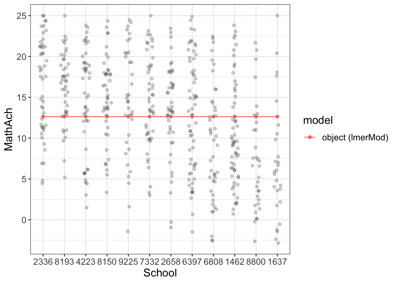
Comments
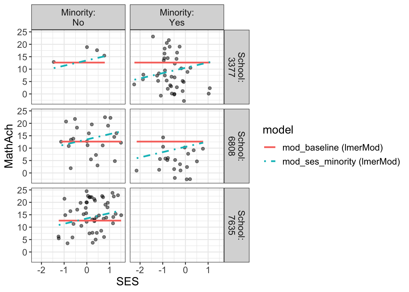
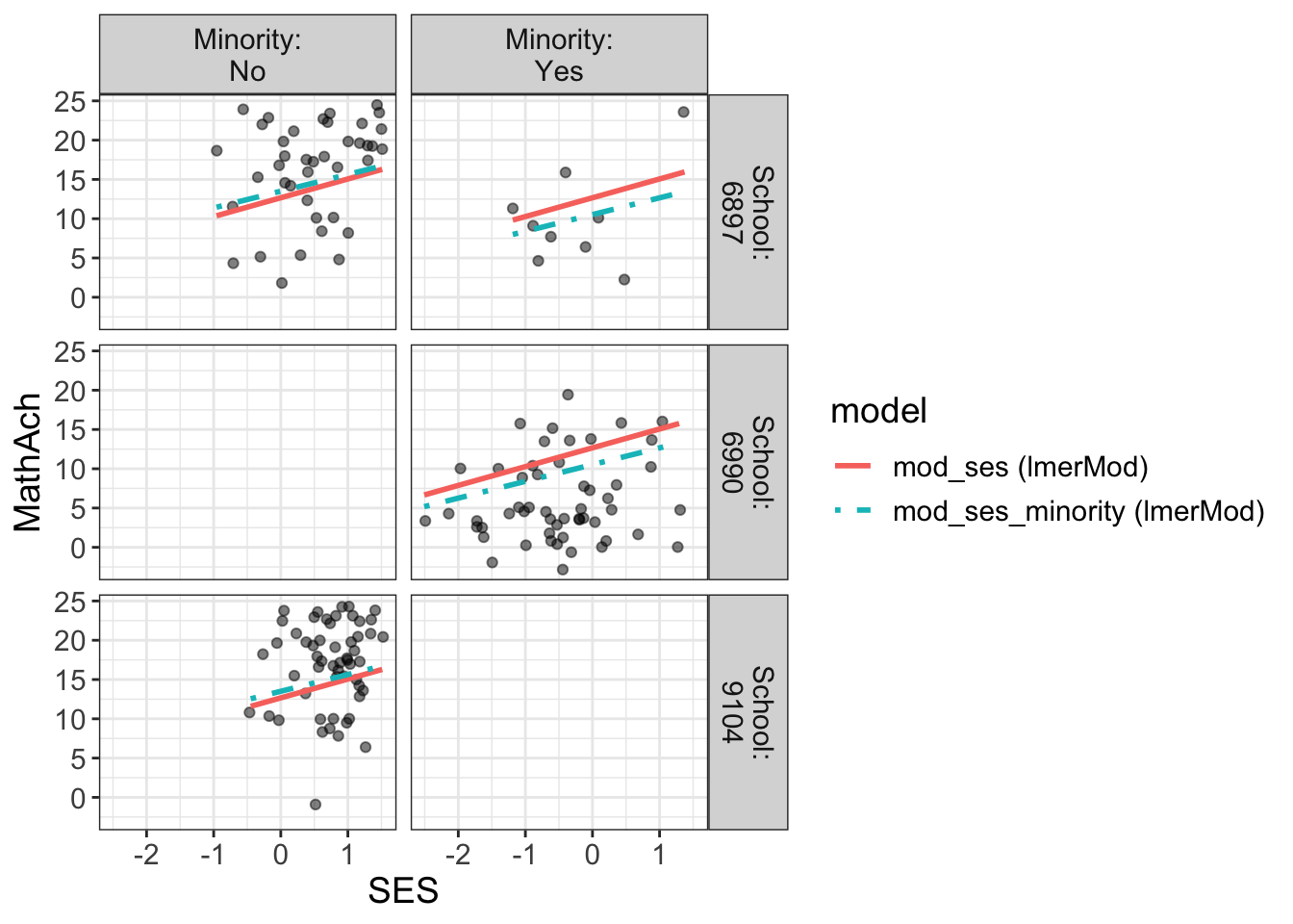
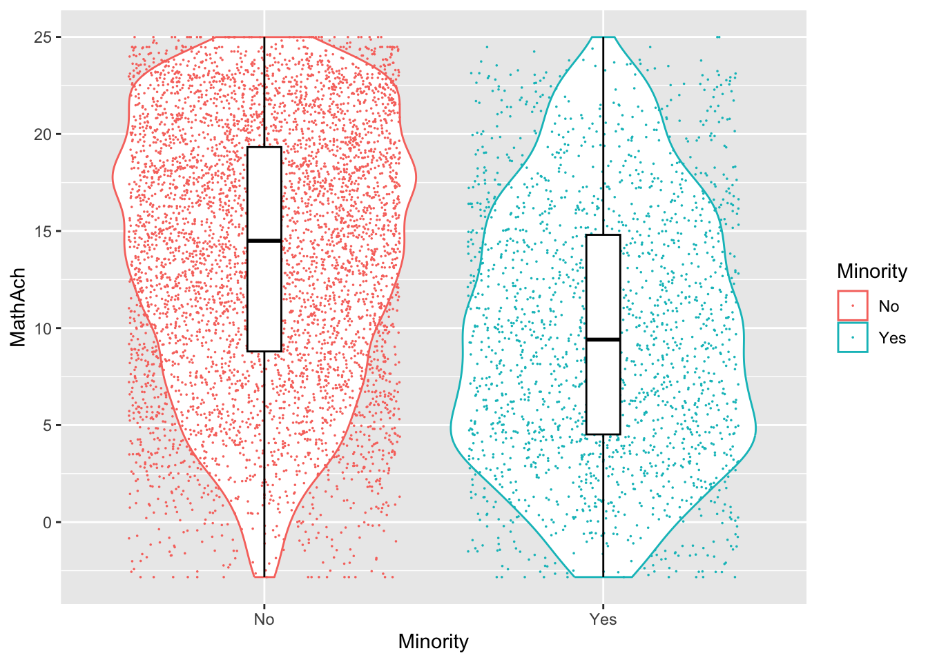
From the above, we have 160 schools with two genders classified as minority or not.
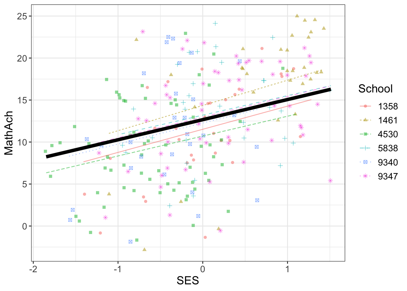
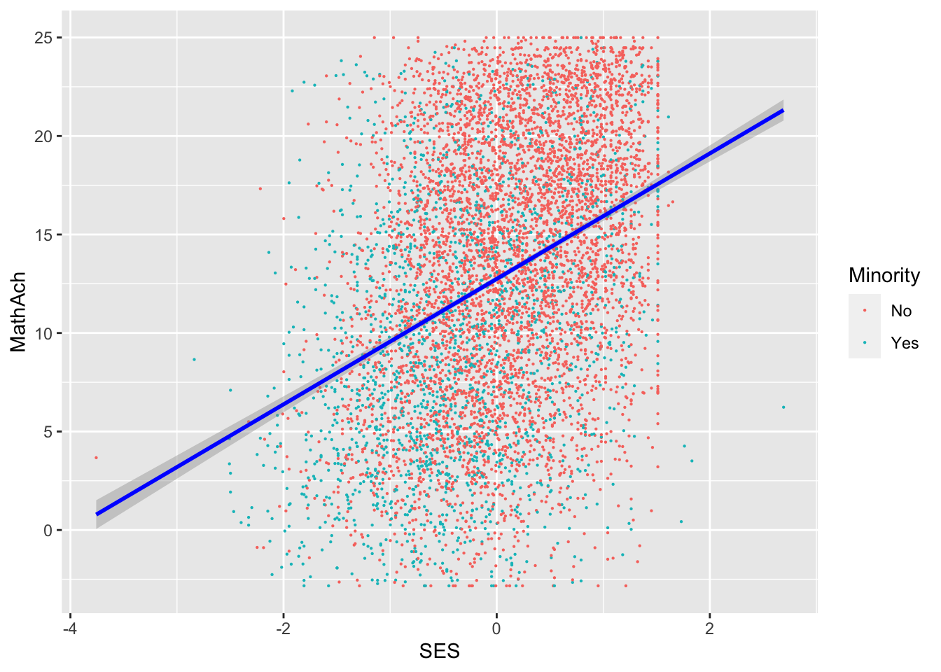
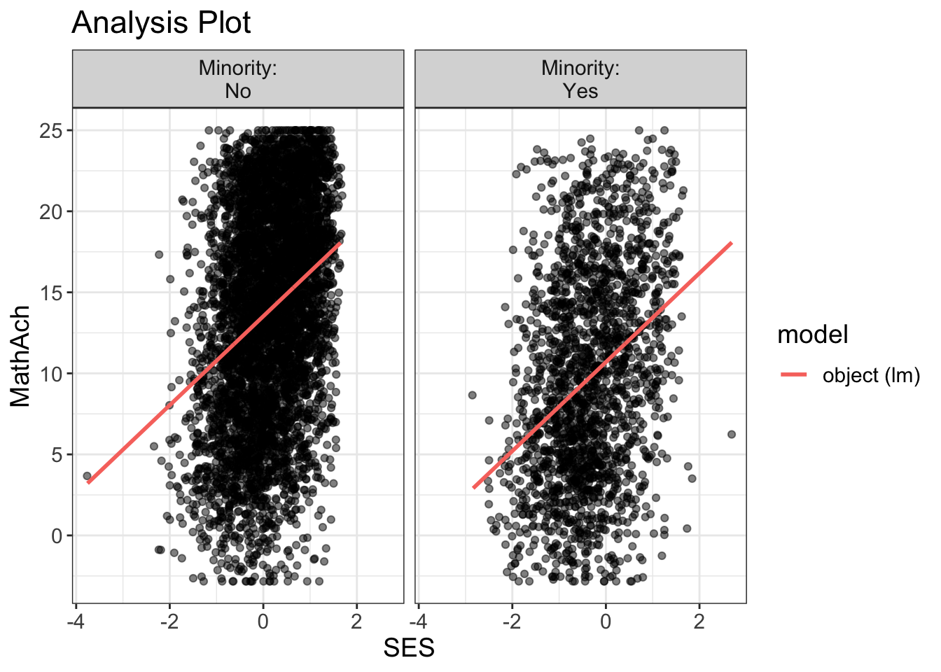
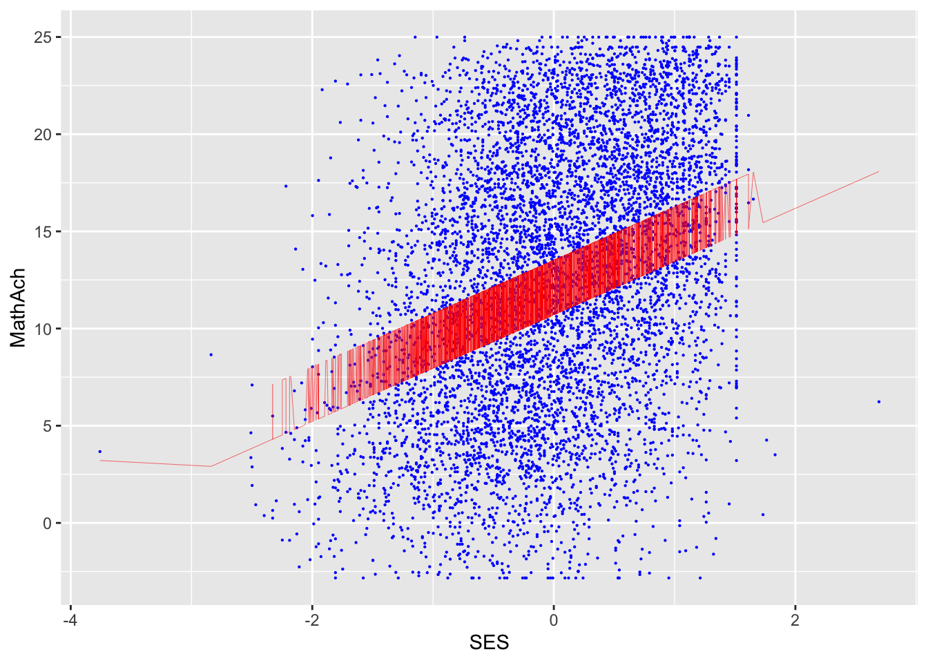
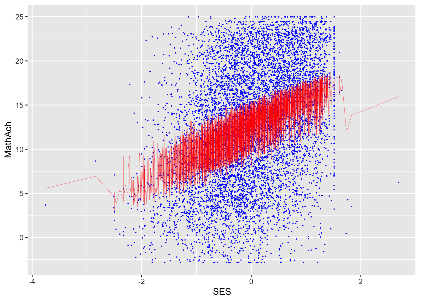
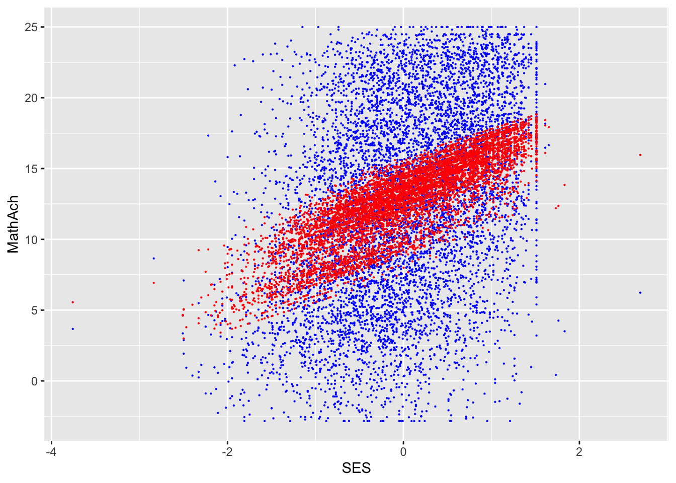
SES and MEANSES look like distributions centered around 0
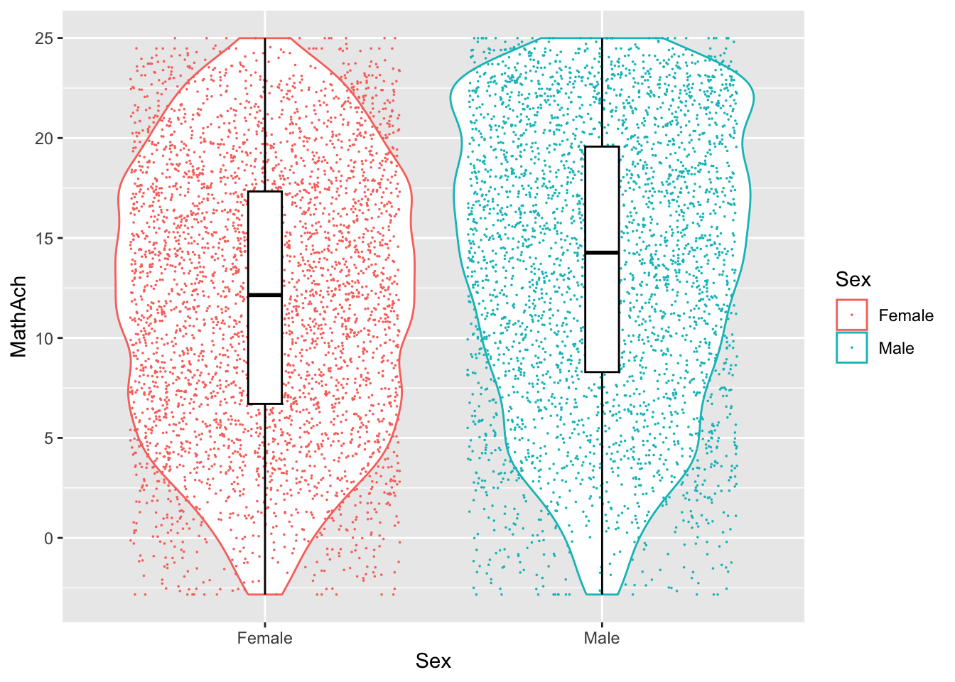
MathAch is centered around ~13 and has -ve scores! Curious how one can attain a negative achievement score in Math: must be somehow a normalized variable.
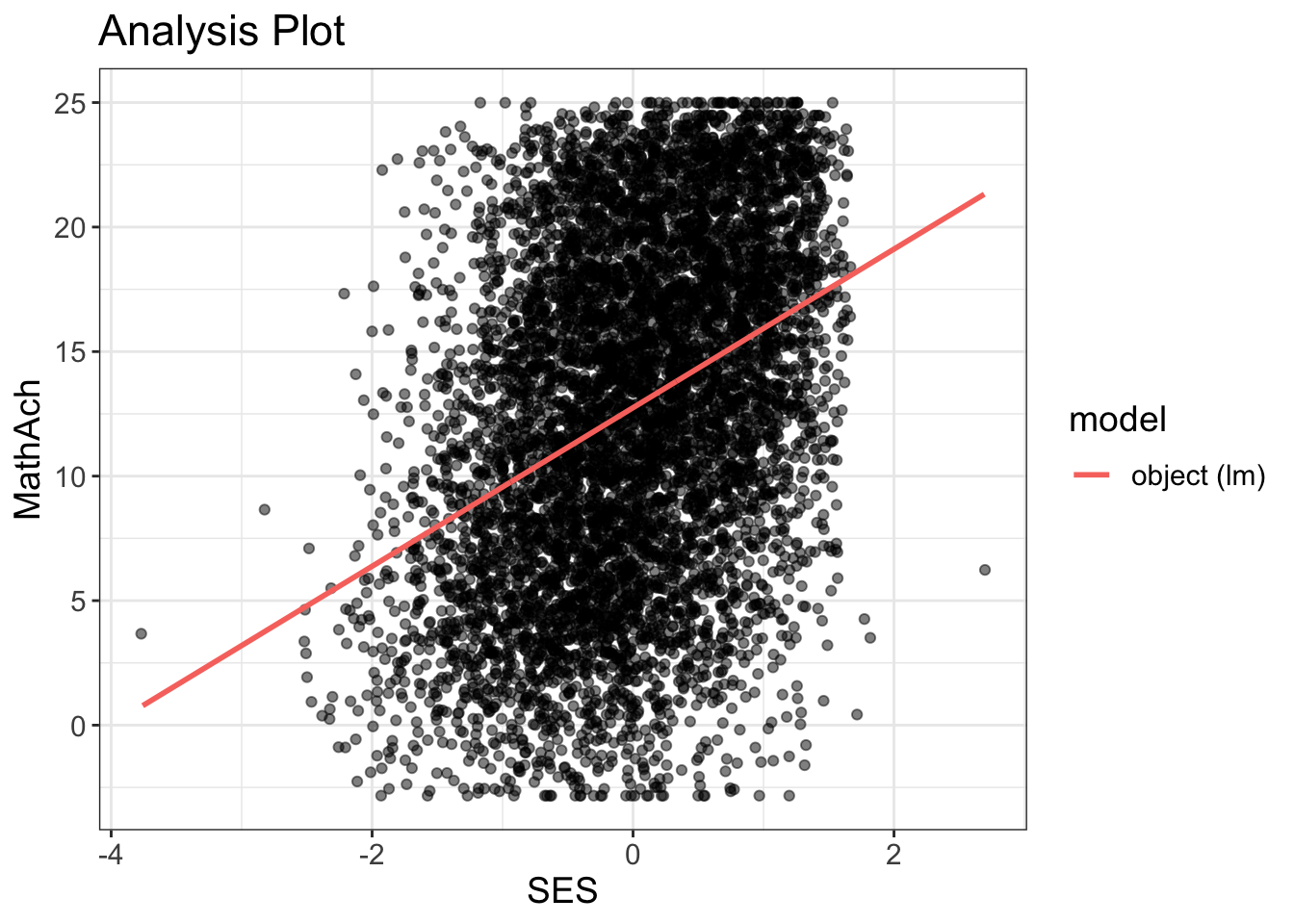
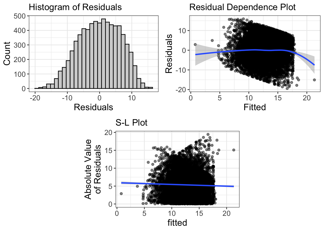
Do some plots to look more closely at distributions