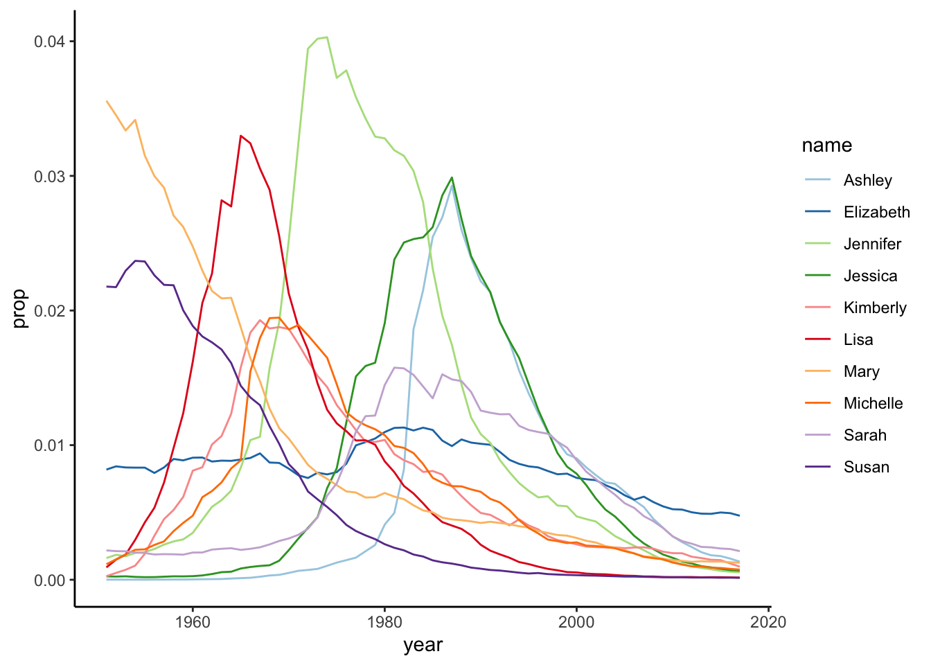
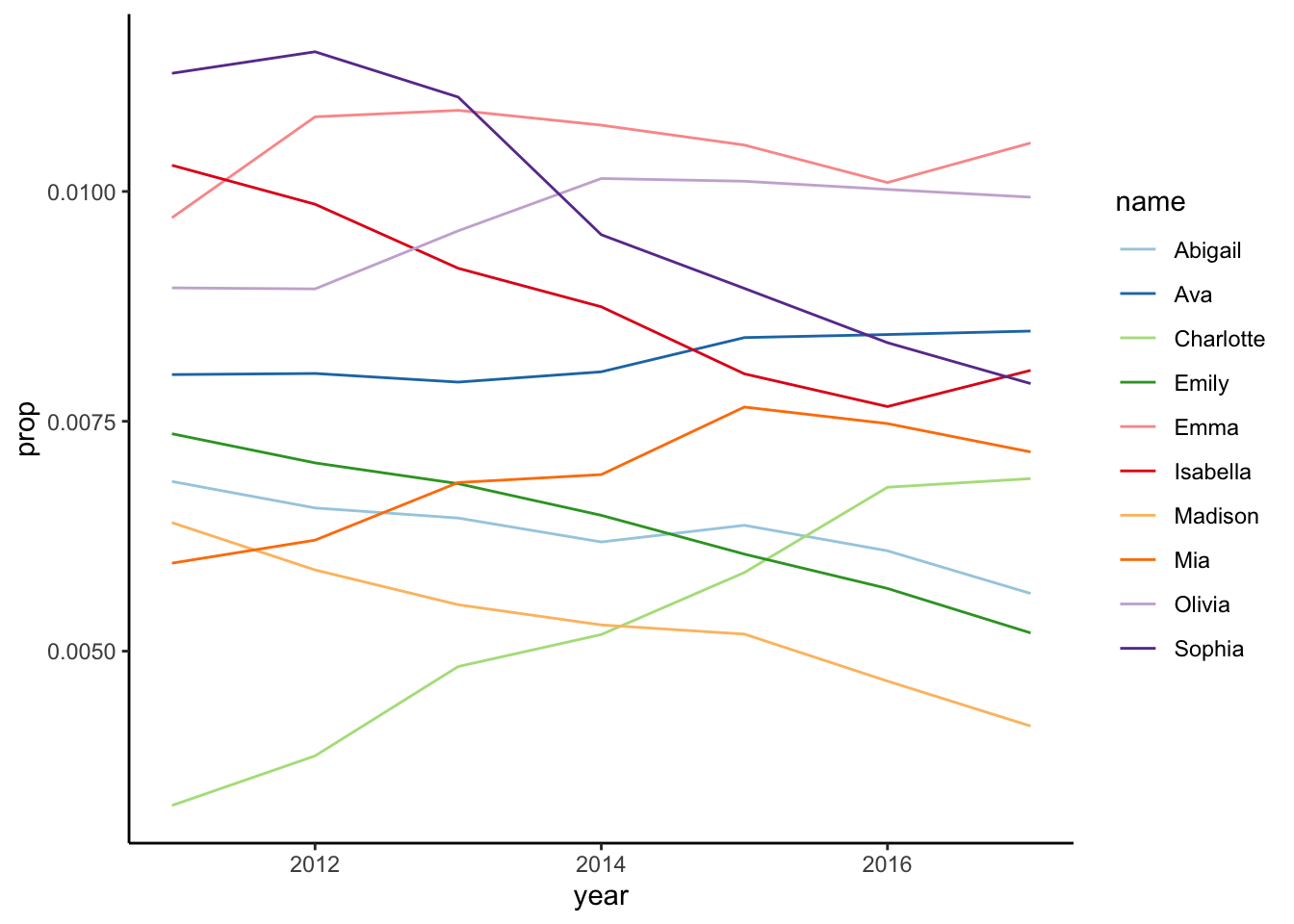
from_year <-2010# get most frequent girl names from 2010 onwardsmost_freq_girls <-get_most_frequent(babynames, select_sex ="F",from = from_year)# plot top girl namesmost_freq_girls |>plot_top(top =5)
Figure 4: Frequent female names from 2010
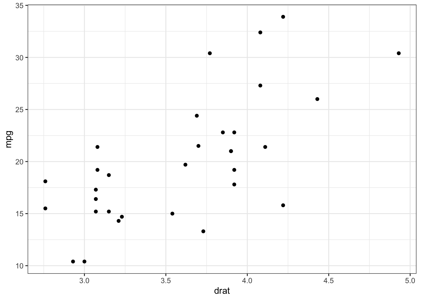
report 4
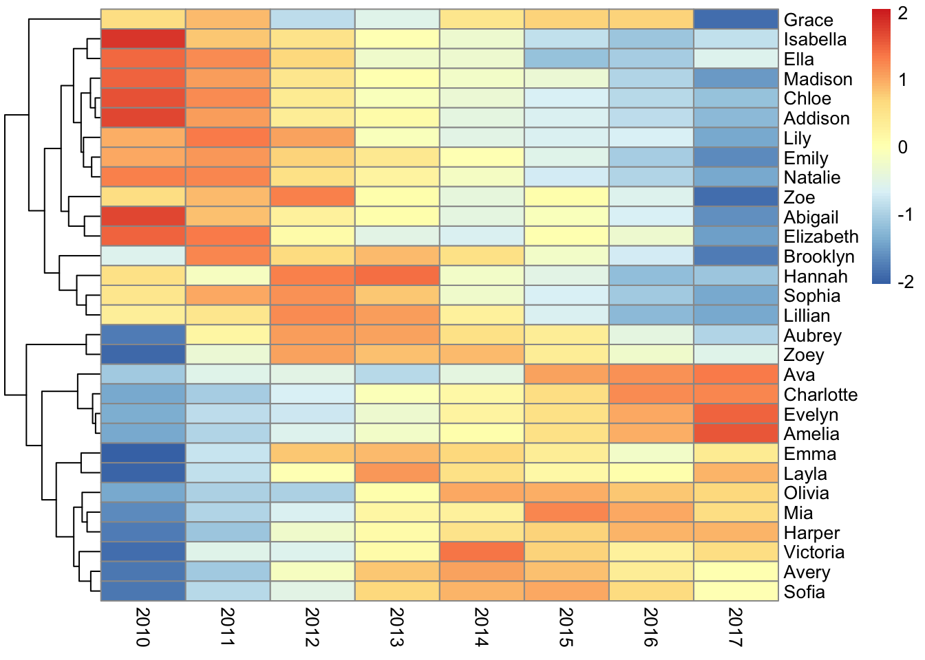
# get top 30 girl names in a matrix# with names in rows and years in columnsprop_df <- babynames |>filter(name %in% most_freq_girls$most_frequent$name[1:30] & sex =="F") |>filter(year >= from_year) |>select(year, name, prop) |>pivot_wider(names_from = year,values_from = prop)prop_mat <-as.matrix(prop_df[, 2:ncol(prop_df)])rownames(prop_mat) <- prop_df$name# create heatmappheatmap(prop_mat, cluster_cols =FALSE, scale ="row")
Figure 5: Frequent female names
report 5
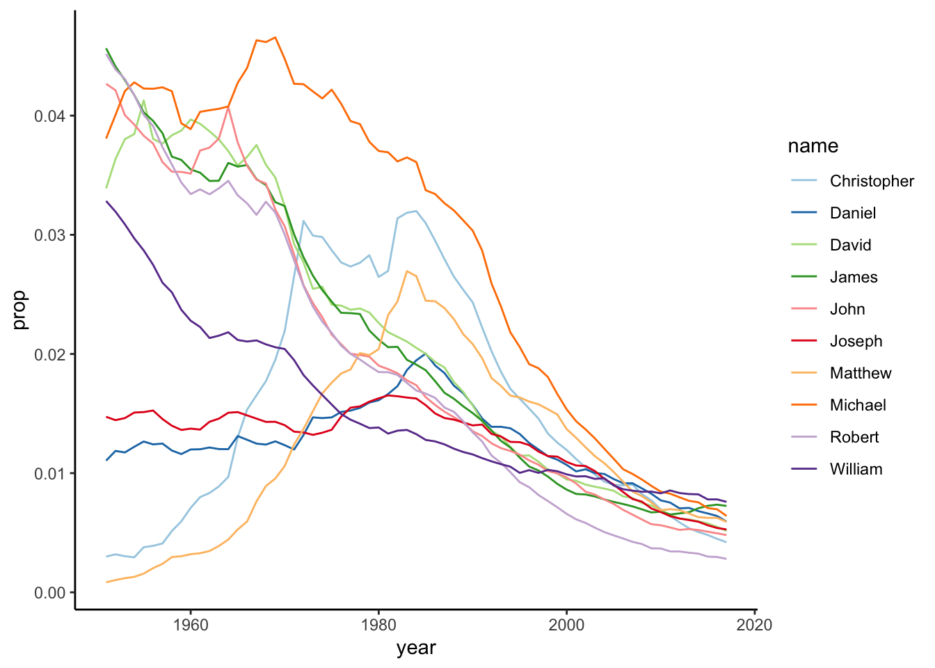
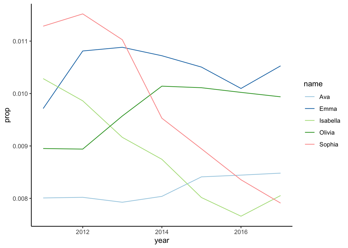
# get most frequent girl names from 2010 onwardsfrom_year <-2010most_freq_girls <-get_most_frequent(babynames, select_sex ="F",from = from_year)# plot top 5 girl namesmost_freq_girls |>plot_top(top =5)# plot top 10 girl namesmost_freq_girls |>plot_top(top =10)# get top 30 girl names in a matrix# with names in rows and years in columnsprop_df <- babynames |>filter(name %in% most_freq_girls$most_frequent$name[1:30] & sex =="F") |>filter(year >= from_year) |>select(year, name, prop) |>pivot_wider(names_from = year,values_from = prop)prop_mat <-as.matrix(prop_df[, 2:ncol(prop_df)])rownames(prop_mat) <- prop_df$name# create heatmappheatmap(prop_mat, cluster_cols =FALSE, scale ="row")
(a) Top 5
(b) Top 10
(c) Top 30
Figure 6: Most popular girl names from 2010 onwards